Accelerate: The Science of DevOps - Building and Scaling High Performing Technology Organizations (2018) had a huge impact in the technology industry. The book describes models of DevOps capabilities and culture, and how organisations can drive improvement in software delivery and reliability. What most people remember from the book, and the largest impact it’s had on the industry, are what are colloquially referred to as the DORA metrics. Four key indicators which strongly correlate with high performing organisations. These metrics were derived from cluster analysis done on a survey of 23,000 people across 2000 organisations.
Three and a half years on are those metrics still relevant? To this day new content marketing 1 is posted repeating the verbatim claims of the book with no critical analysis. I work as a Lead Engineer on the Engineering Insights Platform at a large technology organisation. Over the last three years the org has embraced Accelerate and delivery metrics of all sorts have been recorded. In this post I share my experience and thoughts from seeing these delivery metrics applied in practice.
2023-02 update: Read also DORA Metrics Reference
DORA DevOps Metrics
To begin, a quick overview of the metrics. The State of DevOps study found that high performing organisations showed strong results in all four of these metrics:
- Delivery Lead Time (DLT) - Time it takes from code committed until it is running in production. Keeping this short allows teams to quickly iterate on features, run experiments, and respond to customer feedback.
- Deployment Frequency (DF) - How frequently is software deployed? Used as a proxy for batch size.
- Mean Time to Restore (MTTR) - After a failure in production how quickly is service restored?
- Change Fail Percentage (CFR) - What percentage of deployments to production fail?
Intuitively these metrics balance each other. DLT and DF being related to the velocity of software delivery, and MTTR and CFR to quality and reliability.
The promise of the DORA metrics is that they reveal organisational performance. Indeed they may, but from my experience I propose a different frame: DORA metrics reflect the environment in which teams operate, not team performance. As we’ll talk about later there are many contributing factors to Delivery Lead Time; one of which is team performance. Starting from the premise that the DORA metrics are indicators of system health is more accurate and there’s no implicit blame assigned to teams.
Delivery Lead Time
Accelerate defines the Delivery Lead Time as “the time it takes for work to be implemented, tested, and delivered”. There are many different ways to measure this. I favour calculating the Delivery Lead Time (DLT) for every commit - defined as the time between when the commit was authored and when it got to production.
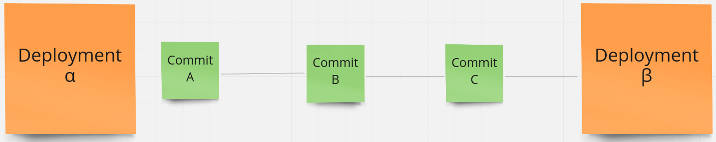
Delivery Lead Time(Commit A) = Time(Deployment β) - Time(Commit A)
Delivery Lead Time(Commit B) = Time(Deployment β) - Time(Commit B)
Delivery Lead Time(Commit C) = Time(Deployment β) - Time(Commit C)
DLTs are then aggregated and features such as the median and standard deviations show value. This aggregated DLT reveals many things including:
- Development Practices - Modern DevOps practices are clear that we should avoid long-running feature branches and merge code into the master branch as frequently as possible. This saves the team toil due to merge conflicts and encourages smaller deployments. By measuring DLT from the time of the first commit we capture the cadence at which code is merged into the master branch.
- Code Review Practices - DLT includes the time taken for code review of a given pull request.
- Batch Size - We prefer many deployments with smaller changesets than fewer deployments with large changesets. This shows we’re continuously delivering value and should reduce the change failure rate.
- Encourages Trunk Based Development - Due to how the DLT is calculated teams practicing Trunk Based Development, Pair Programming, and Continuous Deployment are going to have a much lower DLT than teams following a Pull Request and Code Review workflow.
- Deployment Pipeline - DLT includes deployment pipeline runtime. Well maintained, modern, microservice pipelines can take on the order of 20 minutes to run. Older services, particularly those on legacy/EC2 stacks may take several hours. Pipelines with flakey tests (which require manual re-running during the deployment) can take days to complete.
- Test Coverage and Confidence - Teams that aren’t confident in the test suite spend more time manual testing. This adds to the DLT.
Since publishing this post I’ve written a deep dive into Delivery Lead Time .
Deployment Frequency
Looking at the Deployment Frequency for any given component isn’t that useful. Does a low Deployment Frequency indicate there are problems slowing down deployments, or just that it hasn’t been worked on the last few weeks as work was done in other components?
Deployment Frequency can be aggregated to a team level: of all the components a team owns what is the summed number of deployments? This shows that a team is shipping and is perhaps some proxy for development velocity. I don’t like using metrics to measure team performance. It can negatively affect psychological safety and distracts from the focus of the team. There are a plethora of reasons why a team-aggregated Deployment Frequency might decrease: teams doing discovery work, spikes, contributing code in repositories owned by other teams, or going on holiday. Teams feeling like they need to justify why their Deployment Frequency is low in a given time period is unhealthy.
Accelerate writes that Deployment Frequency was chosen as a proxy for Batch Size:
However, in software, batch size is hard to measure and communicate across contexts as there is no visible inventory. Therefore, we settled on deployment frequency as a proxy for batch size since it is easy to measure and typically has low variability.
Batch Size may have an effect on Deployment Frequency but I don’t think it’s a good proxy. Incidentally Batch Size is also captured in our DLT metric since we measure since time of first commit within a given deployment. Deployment Frequency is easy to measure and I’ve seen it used with great success in the following examples.
- Projects where the deployment pipeline is the bottleneck. Take a large, legacy monolithic application which takes on the scale of days to deploy. Many teams operate in the code base and want to deploy code. Due to the time it takes to deploy teams can’t release as fast as they want. A release calendar becomes necessary and teams often need to book in deployments weeks in advance. Measuring the Deployment Frequency on projects like these is valuable. The act of deploying is the bottleneck, and by seeing Deployment Frequency increase over time any investment or work on the deployment pipeline done by the time can be celebrated. Once the Deployment Frequency reaches a certain point the need for a release calendar will go away.
- Deployments as a signal of project health; is a given component even being deployed? Engineering Teams typically own more components than they can reasonably maintain. Older components owned by the team may be put into maintenance mode and development effectively ceases. However these components still need security patches and teams still need to maintain expertise in these systems. Here Deployment Frequency can be used as a proxy for Software Ownership. It can answer the question “Which components have not been deployed in the last 3 months?” and can go on to reveal things about team workload and organisational priorities.
Mean Time To Restore
Mean Time to Restore (MTTR) promises so much, yet provides zero actual insight to the reliability or incident response functions of an organisation. Accelerate frames this as below:
We asked respondents how long it generally takes to restore service for the primary application or service they work on when a service incident (e.g, unplanned outage, service impairment) occurs
Assuming consistent and high quality incident data was on hand (we’ll talk about this in Change Failure Rate below), what does the MTTR tell us? Well, nothing. It’s a misleading statistic. Štěpán Davidovič of Google published the excellent paper Incident Metrics in SRE . In this he explores the metric and demonstrates that due to the high variance in the incidents any statistical average would be misleading. From the paper:
The problem is not specific to the metric being an arithmetic mean; I’ve demonstrated the same problem with median and other metrics. It is a consequence of the typically low volume of incidents and high variance of their durations. This distribution has been observed on practical data sets from three anonymous companies, as well as the obfuscated data set from Google.
To be clear, if MTTR was being measured then an improvement in this metric is not statistically attributable to any investment or initiative undertaken by the organisation.
Another way of looking at MTTR is ‘once we have the fix, how quickly can we get it out to customers?’ This capability is measured by the Delivery Lead Time metric.
Change Failure Rate
Accelerate defines Change Failure Rate (CFR) as:
[The] percentage of changes for the primary application or service they work on either result in degraded service or subsequently require remediation (e.g., lead to service impairment or outage, require a hotfix, a rollback, a fix-forward, or patch).
Metrics must be automatically measured, and be measured in the same way across the organisation. The Change Failure Rate metric runs into a problem here. What is a Change Failure? Pushing a change that causes an outage is a clear failure. But what if the change unexpectedly increases latency, harms UX, or introduces a bug on a webpage? What if the failure is noticed a month after the change was made? What if it only affected 0.001% of all customers? Change Failures are subjective. They cannot be measured in an automated way, and the dependence on individuals to manually report them means they’ll never be measured the same way across an organisation.
Many organisations have Incident Management Systems but these tend to be (quite rightly) centred around coordinating incident response rather than an analytical system recording the full list of components impacted, which had outages, and windows when customer outages occurred. Similarly Monitoring systems such as New Relic have the gaps. Some components such as APIs might be instrumented and incident data comes through, but others such as libraries or front end components cannot be instrumented.
Given the variety of things one could classify a change failure I suspect the CFR metric has similar variance issues to MTTR.
Better Reliability Metrics
Mean Time to Restore and Change Failure Rate are misleading metrics and cannot be consistently measured across an organisation in an automated way. That said, we still need metrics to monitor the reliability of our systems. We want data to illustrate which systems need the most investment, and to track improvements to those as technical investments are made. The field of Resilience Engineering has shown us that systems fail even when no incremental change was made. These outages (not caused by a deployment or release) would not register on the Change Failure Rate metric, however our customers would still be impacted.
Service Level Objectives (SLOs) are the perfect tool for measuring the availability of our systems. They measure customer experience of the system - the customer doesn’t care whether an outage is change related. Behind SLOs are a number of Service Level Indicators (SLIs). SLIs are quantitative, objective measures of availability, latency, and error rate. They are measured automatically - typically through platforms such as New Relic. SLOs and SLIs are defined by teams.
SLOs encapsulate MTTR and CFR and serve similar functions:
- They start the same conversations. If some SLIs are degraded a team will investigate them and see what contributed to it. Contributing factors may include slow recovery times, more change failures than usual, or something else entirely.
- SLOs incentivise the outcome we want. By using SLOs as the metric teams optimise for service reliability and incident response. By using CFR as a measure the change failure rate may be reduced at the cost of other failures.
SLOs and SLIs were introduced in Google’s Site Reliability Engineering (2016) . Since then these metrics have become industry standard and there’s a general understanding of them. Discussion around SLOs and system availability is curiously absent in Accelerate however in the State of DevOps Report 2018 (published at the end of the same year Accelerate was published) they add a fifth metric, Availability. In the State of DevOps Report 2021 this was re-framed as Reliability.
The fifth metric represents operational performance and is a measure of modern operational practices. The primary metric for operational performance is reliability, which is the degree to which a team can keep promises and assertions about the software they operate.
Historically we have measured availability rather than reliability, but because availability is a specific focus of reliability engineering, we’ve expanded our measure to reliability so that availability, latency, performance, and scalability are more broadly represented. Specifically, we asked respondents to rate their ability to meet or exceed their reliability targets. We found that teams with varying degrees of delivery performance see better outcomes when they also prioritize operational performance.
DevOps Capabilities
Regardless of intent, implementing metrics on any process drives practices to achieve an outcome. Organisations must be clear on the outcome and the DevOps Capabilities needed to achieve these. Only then do metrics come in which reflect adoption or effectiveness of the outcome and capabilities desired.
An example of this is an organisation which is facing multi-day software deployments that are often plagued by quality issues. An outcome the organisation may want is for teams to be able to release whenever they want, and to reduce downtime to customers. The organisation identifies the key DevOps Capabilities which it needs to implement, for example Deployment Automation, Continuous Delivery, and Test Automation. Resources are provided to teams to learn and implement these capabilities. As teams adopt practices to progress toward these capabilities we would expect to see a reduction in Delivery Lead Time, and increase in Deployment Frequency, and an improvement in SLO availability.
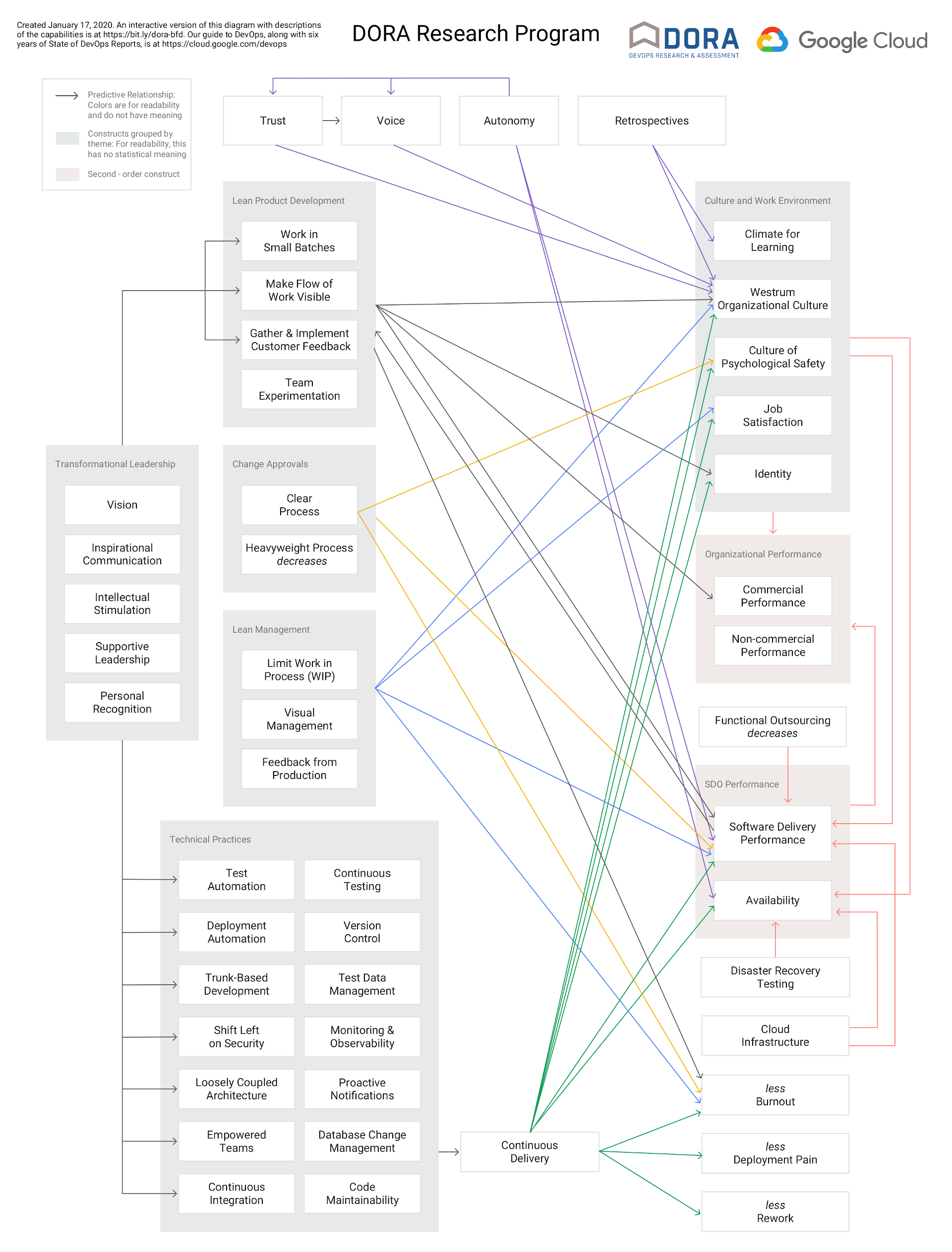
My favourite part of Accelerate is the DevOps Capability Model . It visualises the value technical practices have on culture, wellbeing, and the work environment. This has evolved over the years and is shown below. An interactive version is available here .
Micro Macro Metrics
Accelerate is written for executives looking to build effective and efficient DevOps technology organisations. The DORA metrics, as discussed in the book, are treated at that macro/management level. Viewing metrics such as DLT and DF aggregated across organisational units is valuable and can quickly reveal areas of an organisation that need more investment. From my experience of working in an organisation that has adopted the metrics Accelerate misses the best part: when engineering teams and individual contributors engage directly with metrics.
Engineering teams are full of talented and highly driven people. With access to these metrics they can be the ones who drive improvement. They’re not so concerned about metrics aggregated at a portfolio level, rather they want to see metrics at the micro level of the software and products they develop. Engineering teams are experts in the systems they operate. If organisational outcomes are clear (eg. the ability to deploy on demand, improve availability to customers) then they can be the ones who propose improvements and DevOps Capabilities needed to achieve those outcomes. Because teams are experts in the systems they are tasked to improve, the proposed improvements are most likely highly targeted, effective, and realistic to implement.
The metrics, when observed at a micro-level by engineering teams, enables these experts of the systems to make and measure effective change that aligns with organisational outcomes. They start conversations and can be used as objective data to support investment proposals. This is bottom-up improvement, and is a key part of the generative culture which Accelerate describes.
Conclusion
The core message of Accelerate is still relevant: the software delivery capability of an organisation is a critical factor in outcomes such as availability of systems, happiness of employees, long term maintainability of systems, and ultimately the success of the organisation through ability to respond to changes in the market. The metrics used to measure software delivery capability have matured. Delivery Lead Time and Deployment Frequency give insight into software delivery practices, and SLOs have replaced Mean Time to Recovery and Change Failure Rate as a measure of reliability.
These metrics give insight into the health of the systems teams operate. For executive management the delivery metrics can be aggregated to an organisational portfolio level giving a macro-level view. For teams the metrics can be viewed at the component level. These metrics give teams direct feedback and provide reliable data that enables them to experiment in ways of working and technical practices.